rm(list=ls()) 2023-24-PSYC122-w16-workbook-answers
Introduction
In Week 16, we aim to develop skills in visualizing and testing the associations between variables in psychological data.
We do this to learn how to answer research questions like:
- What person attributes predict success in understanding?
- Can people accurately evaluate whether they correctly understand written health information?
These kinds of research questions can be answered using methods like correlation and linear models.
We will consolidate and extend learning on data visualization:
- Use histograms to examine the distributions of variables;
- Use scatterplots to examine the relationships we may observe or predict.
Naming things
I will format dataset names like this:
study-two-general-participants.csv
I will also format variable (data column) names like this: variable
I will also format value or other data object (e.g. cell value) names like this: studyone
I will format functions and library names like this: e.g. function ggplot() or e.g. library {tidyverse}.
The data we will be using
In this activity, we use data from a second 2020 study of the response of adults from a UK national sample to written health information:
study-two-general-participants.csv
Answers
Step 1: Set-up
To begin, we set up our environment in R.
Task 1 – Run code to empty the R environment
Task 2 – Run code to load relevant libraries
library("tidyverse")── Attaching core tidyverse packages ──────────────────────── tidyverse 2.0.0 ──
✔ dplyr 1.1.4 ✔ readr 2.1.4
✔ forcats 1.0.0 ✔ stringr 1.5.0
✔ ggplot2 3.5.1 ✔ tibble 3.2.1
✔ lubridate 1.9.2 ✔ tidyr 1.3.0
✔ purrr 1.0.2
── Conflicts ────────────────────────────────────────── tidyverse_conflicts() ──
✖ dplyr::filter() masks stats::filter()
✖ dplyr::lag() masks stats::lag()
ℹ Use the conflicted package (<http://conflicted.r-lib.org/>) to force all conflicts to become errorsStep 2: Load the data
Task Task 3 – Read in the data file we will be using
The data file is called:
study-two-general-participants.csv
Use the read_csv() function to read the data file into R:
study.two.gen <- read_csv("study-two-general-participants.csv")Rows: 172 Columns: 12
── Column specification ────────────────────────────────────────────────────────
Delimiter: ","
chr (5): participant_ID, study, GENDER, EDUCATION, ETHNICITY
dbl (7): mean.acc, mean.self, AGE, SHIPLEY, HLVA, FACTOR3, QRITOTAL
ℹ Use `spec()` to retrieve the full column specification for this data.
ℹ Specify the column types or set `show_col_types = FALSE` to quiet this message.When you read the data file in, give the data object you create a clear name e.g. study.two.gen.
Task 4 – Inspect the data file
Use the summary() or head() functions to take a look
summary(study.two.gen) participant_ID mean.acc mean.self study
Length:172 Min. :0.4107 Min. :3.786 Length:172
Class :character 1st Qu.:0.6786 1st Qu.:6.411 Class :character
Mode :character Median :0.7679 Median :7.321 Mode :character
Mean :0.7596 Mean :7.101
3rd Qu.:0.8393 3rd Qu.:7.946
Max. :0.9821 Max. :9.000
AGE SHIPLEY HLVA FACTOR3
Min. :18.00 Min. :23.00 Min. : 3.000 Min. :29.00
1st Qu.:25.00 1st Qu.:32.75 1st Qu.: 7.750 1st Qu.:47.00
Median :32.50 Median :36.00 Median : 9.000 Median :51.00
Mean :35.37 Mean :35.13 Mean : 9.064 Mean :51.24
3rd Qu.:44.00 3rd Qu.:39.00 3rd Qu.:11.000 3rd Qu.:56.25
Max. :76.00 Max. :40.00 Max. :14.000 Max. :63.00
QRITOTAL GENDER EDUCATION ETHNICITY
Min. : 6.00 Length:172 Length:172 Length:172
1st Qu.:12.00 Class :character Class :character Class :character
Median :14.00 Mode :character Mode :character Mode :character
Mean :13.88
3rd Qu.:16.00
Max. :20.00 Q.1. What is the median of
AGE?A.1. 32.50
Q.2. What class is the variable
ETHNICITY?A.2. character
Q.3. Does the summary indicate if any variable has missing values (NAs)?
Q.3. No
Task 5 – Change the class or type of the variable ETHNICITY to factor
You can use the as.factor() function you have used before:
study.two.gen$ETHNICITY <- as.factor(study.two.gen$ETHNICITY)- Q.4. After you have done this, what information does
summary()give you about the variableETHNICITY?
summary(study.two.gen) participant_ID mean.acc mean.self study
Length:172 Min. :0.4107 Min. :3.786 Length:172
Class :character 1st Qu.:0.6786 1st Qu.:6.411 Class :character
Mode :character Median :0.7679 Median :7.321 Mode :character
Mean :0.7596 Mean :7.101
3rd Qu.:0.8393 3rd Qu.:7.946
Max. :0.9821 Max. :9.000
AGE SHIPLEY HLVA FACTOR3
Min. :18.00 Min. :23.00 Min. : 3.000 Min. :29.00
1st Qu.:25.00 1st Qu.:32.75 1st Qu.: 7.750 1st Qu.:47.00
Median :32.50 Median :36.00 Median : 9.000 Median :51.00
Mean :35.37 Mean :35.13 Mean : 9.064 Mean :51.24
3rd Qu.:44.00 3rd Qu.:39.00 3rd Qu.:11.000 3rd Qu.:56.25
Max. :76.00 Max. :40.00 Max. :14.000 Max. :63.00
QRITOTAL GENDER EDUCATION ETHNICITY
Min. : 6.00 Length:172 Length:172 Asian: 15
1st Qu.:12.00 Class :character Class :character Black: 5
Median :14.00 Mode :character Mode :character Mixed: 7
Mean :13.88 White:145
3rd Qu.:16.00
Max. :20.00 A.4. We can see that ETHNICITY lists observations following UK Office National Statistics ethnicity grouping:
Asian: 15
Black: 5
Mixed: 7
White: 145
Step 3: Use histograms to examine the distributions of variables
Task 6 – Draw histograms to examine the distributions of variables
Hint: Task 6
Use ggplot() with geom_histogram().
The first time we do this, we take things step-by-step.
Here’s an example: run the line of code and see the result in the Plots window in R-Studio.
ggplot(data = study.two.gen, aes(x = mean.acc)) + geom_histogram()`stat_bin()` using `bins = 30`. Pick better value with `binwidth`.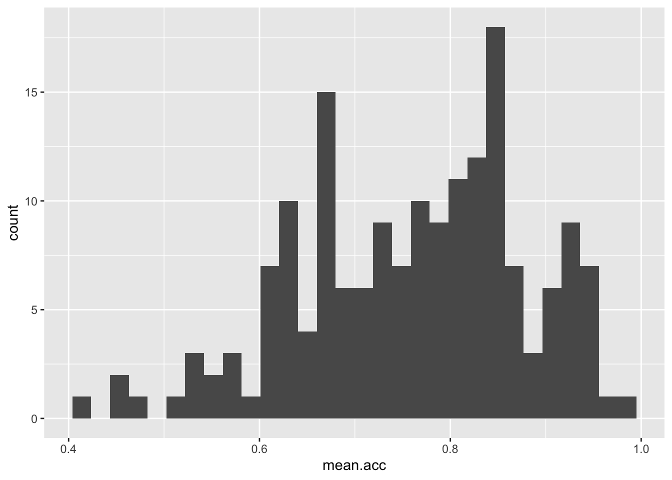
These are the steps, set out one at a time:
ggplot(...)you tell R you want to make a plot using theggplot()functionggplot(data = study.two.gen ...)you tell R you want to make a plot with thestudy.two.gendataggplot(..., aes(x = mean.acc))you tell R that you want to make a plot with the variablemean.acc– here, you specify the aesthetic mapping,x = mean.accggplot(...) + geom_histogram()you tell R you want to plot values ofmean.accas a histogram
Questions: Task 6
Q.5. Did you get a message in the
Consolewindow inR-Studio: what does it say?A.5. The message says:
stat_bin()usingbins = 30. Pick better value withbinwidth.Q.6. Draw two different histograms to examine the distributions of two different variables:
SHIPLEYandHLVA
ggplot(data = study.two.gen, aes(x = SHIPLEY)) + geom_histogram()`stat_bin()` using `bins = 30`. Pick better value with `binwidth`.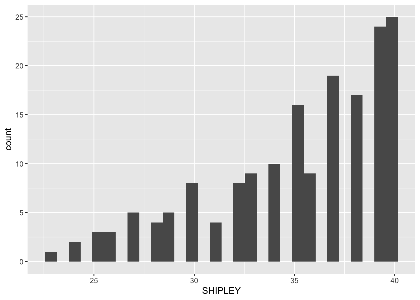
ggplot(data = study.two.gen, aes(x = HLVA)) + geom_histogram()`stat_bin()` using `bins = 30`. Pick better value with `binwidth`.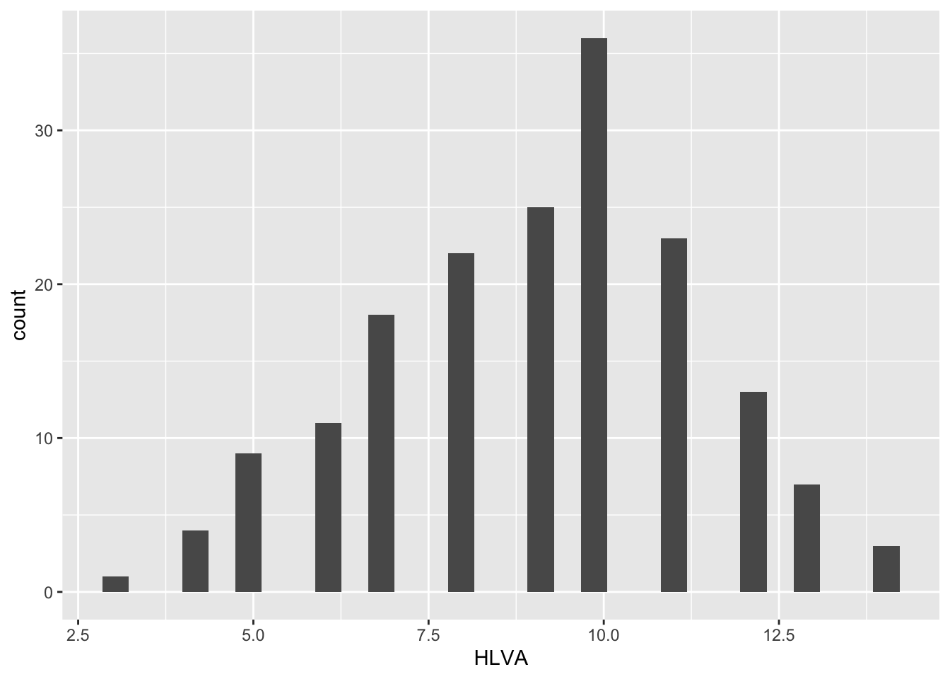
- Q.7. Now re-do both plots: can you change the binwidth in
geom_histogram()to make the bars wider?
If you are going to change binwidth the number you use needs to be a number larger than
the minimum and smaller than the maximum for the variable.
Remember, min and max values are given for each numeric variable in summary().
ggplot(data = study.two.gen, aes(x = SHIPLEY)) + geom_histogram(binwidth = 2)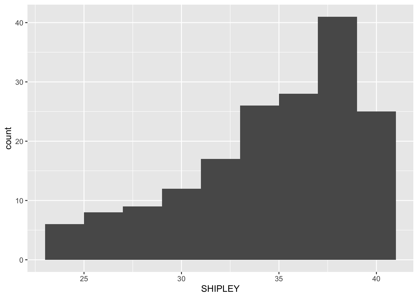
ggplot(data = study.two.gen, aes(x = HLVA)) +
  geom_histogram(binwidth = 2)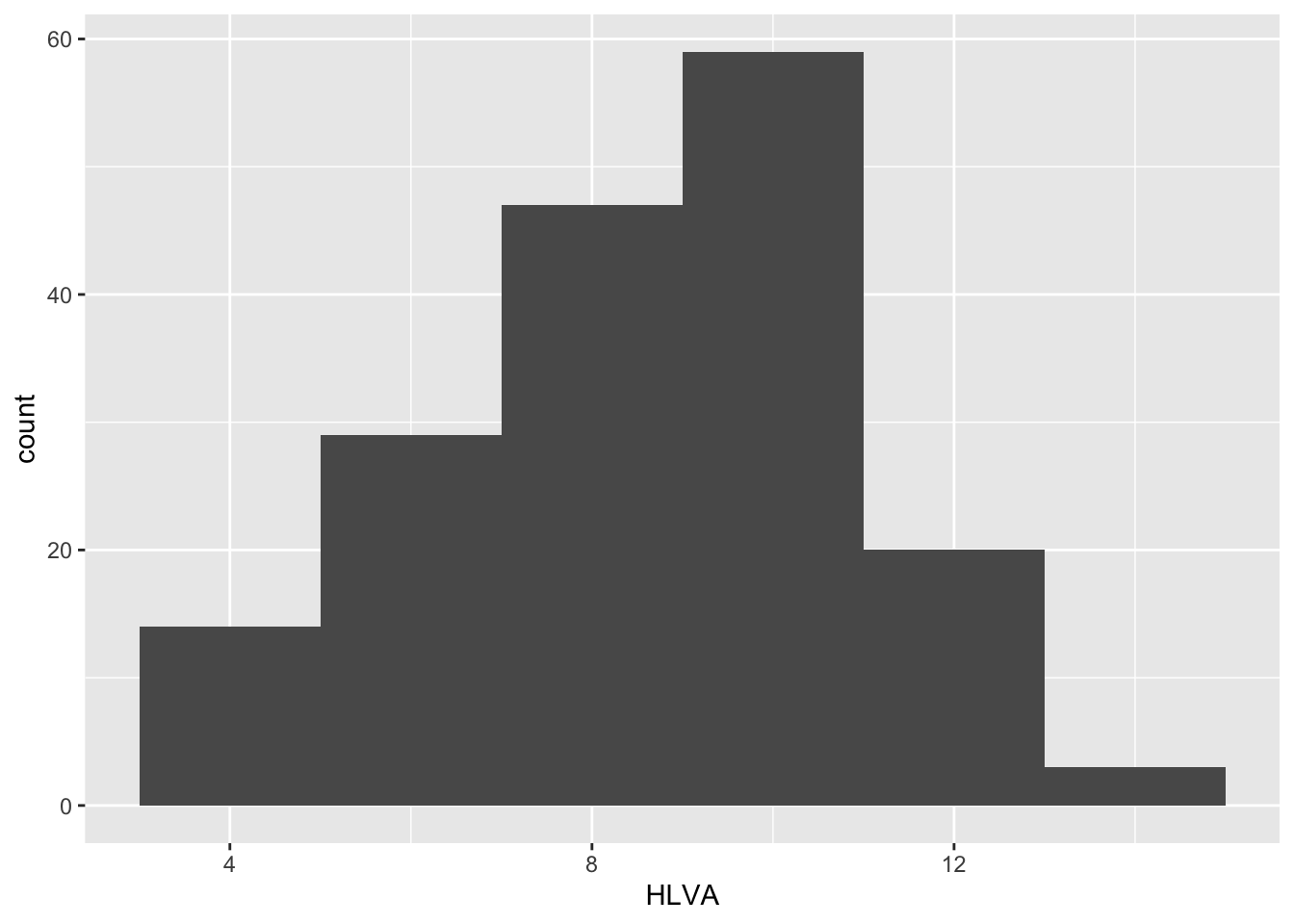
We adjust binwidth typically to improve the appearance of the plot.
This is a bit subjective so try different numbers and see how you feel about the changes in appearance.
We want histograms that show us enough detail about the frequency of occurrence of groupings (bins) of values for each variable.
But we do not want histograms that show us so much detail it is difficult to see the pattern for the distribution.
Q.8 – How would you describe the distributions – in a sentence – of the distributions of the
SHIPLEYandHLVAvariable values for our sample?A.8. The
SHIPLEYvalues lie between about 25 and 40, and are skewed towards high scores.A.8. The
HLVAvalues lie between 4 and about 14, and peak in the middle (near 7).
Step 4: Edit your plots to make them look good
Task 7 – Edit the appearance of a histogram plot for one numeric variable
Note that ggplot() code does not all have to be on the same line.
You can create a new plot for each edit so you can see what difference your edits make.
- Q.9. Edit the appearance of the bars using
binwidth
ggplot(data = study.two.gen, aes(x = HLVA)) +
geom_histogram(binwidth = 2)
- Q.10. Edit the colour of the background using
theme_bw()
ggplot(data = study.two.gen, aes(x = HLVA)) +
  geom_histogram(binwidth = 2) +
  theme_bw()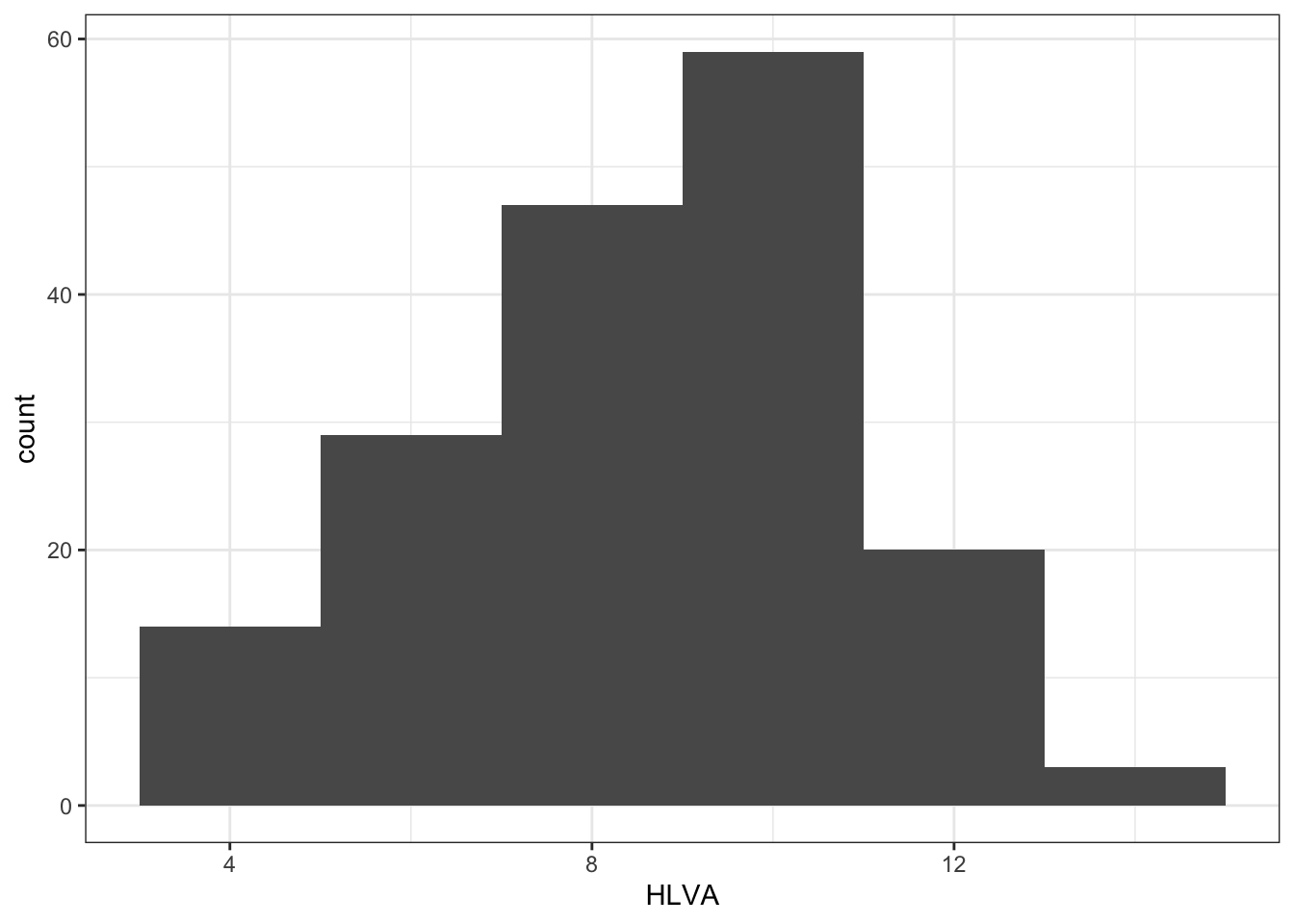
- Q.11. Edit the appearance of the labels using
labs()
ggplot(data = study.two.gen, aes(x = HLVA)) +
  geom_histogram(binwidth = 2) +
  theme_bw() +
  labs(x = "HLVA", y = "count")
Notice how, if you are doing edits in steps, one line at a time, each line in your code except the last one ends in a +.
What we are doing is telling R we want this + this + this … Each line then adds an extra step.
You can break this code by not adding a + at the end of each bit (except the last line).
Notice that how to break the code, and how to figure out how to fix the break, are discussed in the how-to .R
Step 5: Now draw scatterplots to examine associations between variables
Task 8 – Create a scatterplot to examine the association between some variables
We are working with geom_point() and you need x and y aesthetic mappings
ggplot(data = study.two.gen, aes(x = HLVA, y = mean.acc)) +
  geom_point()
This plot shows the possible association between x-axis variable HLVA and y-axis variable mean.acc.
The plot code moves through the following steps:
ggplot(...)make a plotggplot(data = study.two.gen, ...)with thestudy.two.gendatasetggplot(...aes(x = HLVA, y = mean.acc))using two aesthetic mappings:
- x = HLVA
mapHLVA` values to x-axis (horizontal, left to right) positions - y = mean.acc
mapmeann.acc` values to y-axis (vertical, bottom to top) positions
geom_point()show the mappings as points
Task 9 – Now do scatterplots with every numeric predictor variable in the study.two.gen dataset
You always want to use as the y-axis variable the outcome mean.acc so:
y = mean.acc
Then you can use each numeric predictor variable as the x-axis variable so:
x = mean.self
Remember what we saw with summary(): not every variable consists of numbers
If the summary() does not show you a mean for a variable, then R does not think that variable is numeric
It can be hard to decide what an association looks like:
Draw the plot, answer the question
ggplot(data = study.two.gen, aes(x = mean.self, y = mean.acc)) +
geom_point() 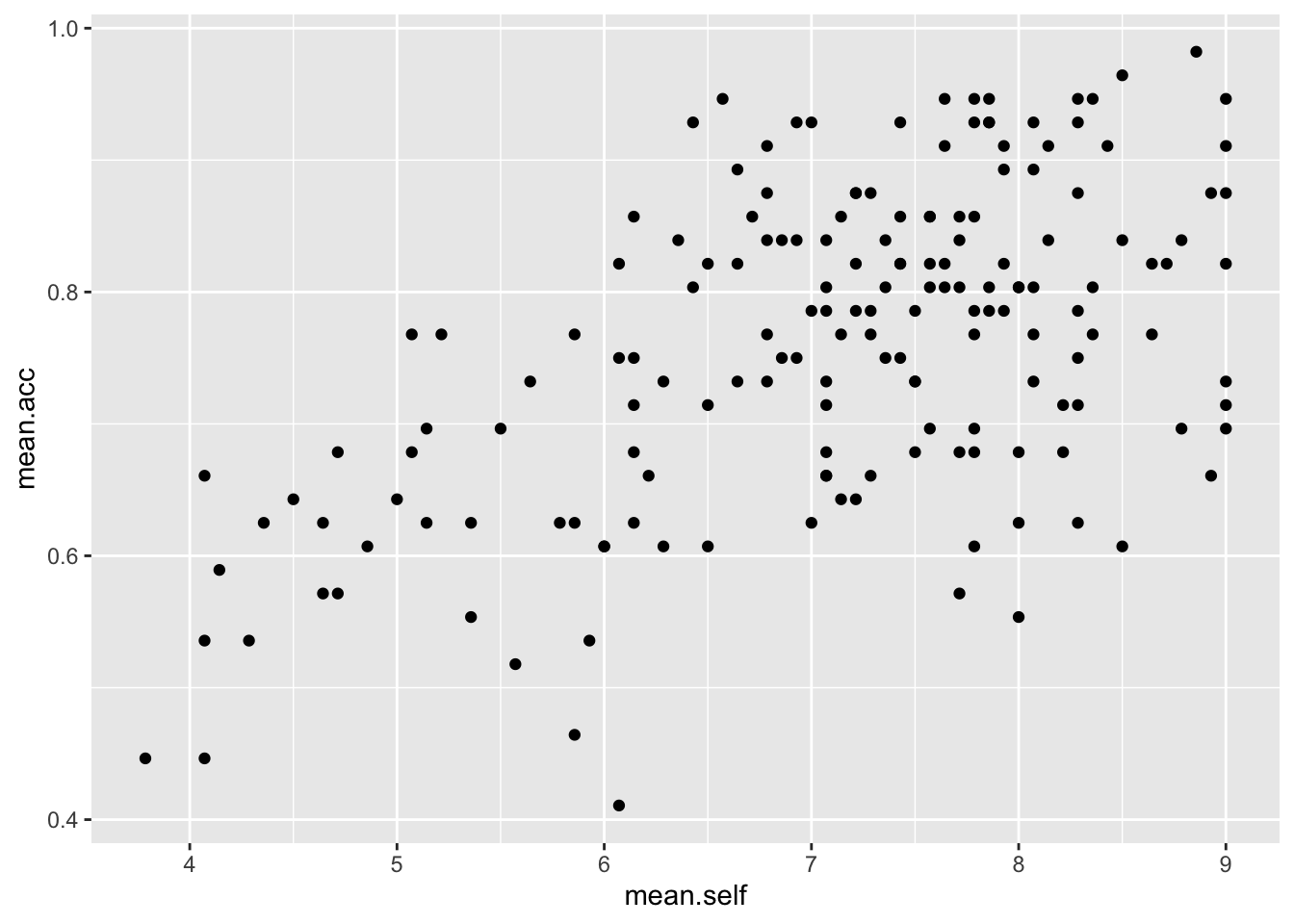
Q.12. What is the shape (direction) of the association between
mean.selfandmean.acc?A.12. Increase in
mean.selfis associated with increase inmean.acc
Draw the plot, answer the question
ggplot(data = study.two.gen, aes(x = AGE, y = mean.acc)) +
geom_point() 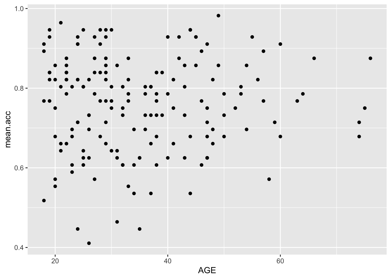
Q.13. What is the shape (direction) of the association between
AGEandmean.acc?A.13. There is no clear association between
AGEandmean.acc
Draw the plot, answer the question
ggplot(data = study.two.gen, aes(x = SHIPLEY, y = mean.acc)) +
geom_point() 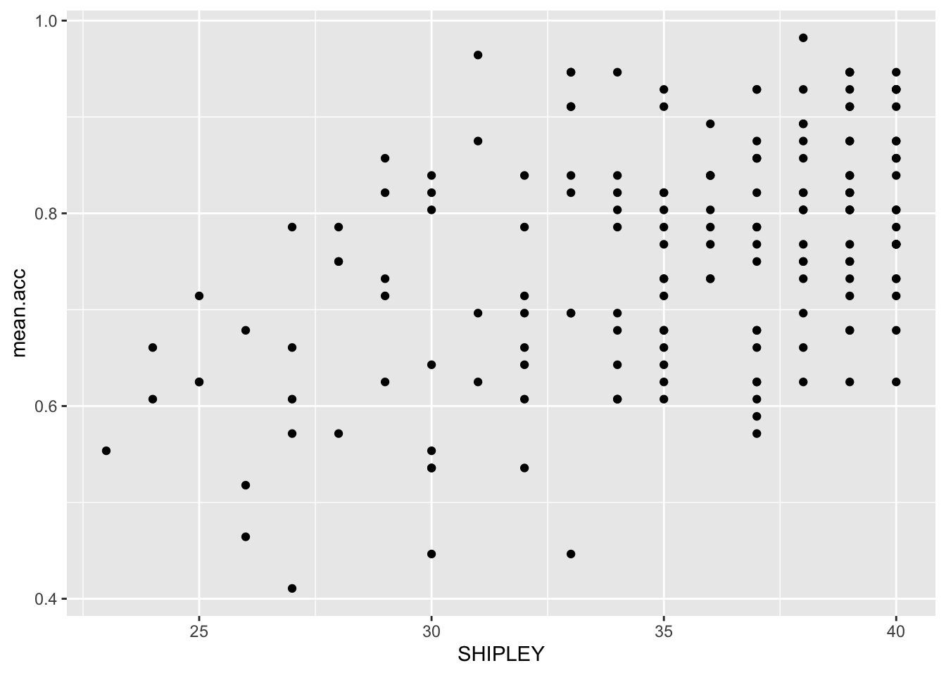
Q.14. What is the shape (direction) of the association between
SHIPLEYandmean.acc?A.14. Increase in
SHIPLEYis associated with increase inmean.acc
Draw the plot, answer the question
ggplot(data = study.two.gen, aes(x = HLVA, y = mean.acc)) +
geom_point() 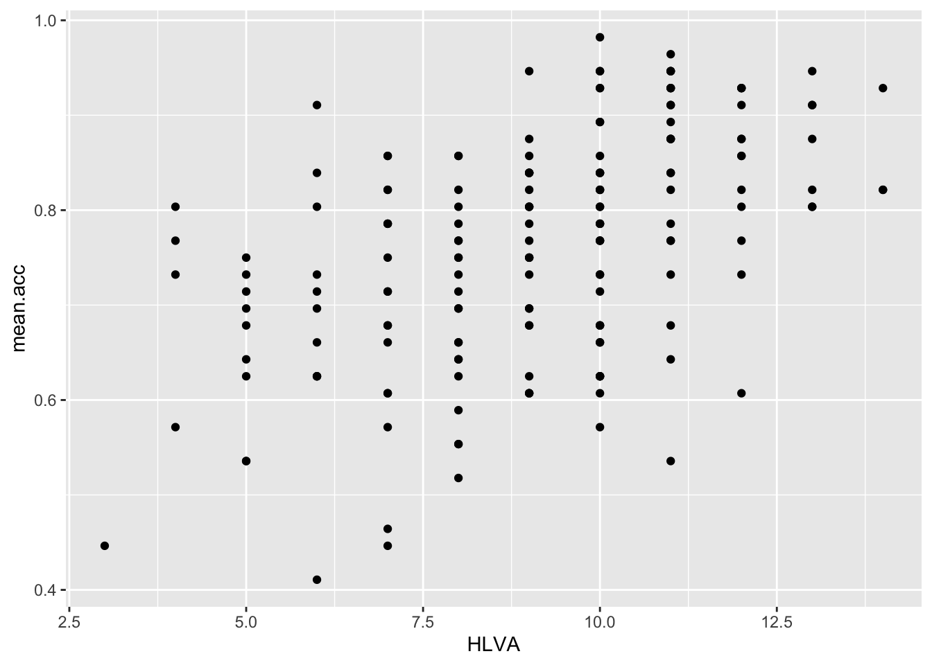
Q.15. – What is the shape (direction) of the association between
HLVAandmean.acc?A.15. Increase in
HLVAis associated with increase inmean.acc
Draw the plot, answer the question
ggplot(data = study.two.gen, aes(x = FACTOR3, y = mean.acc)) +
geom_point() 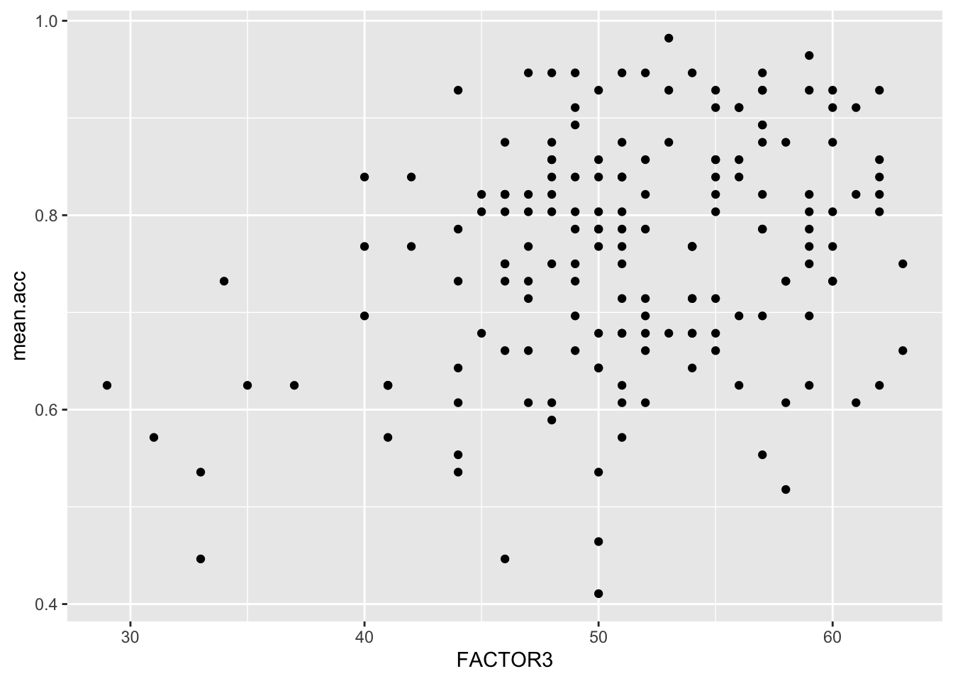
Q.16. What is the shape (direction) of the association between
FACTOR3andmean.acc?A.16. Increase in
FACTOR3is associated with increase inmean.acc
Draw the plot, answer the question
ggplot(data = study.two.gen, aes(x = QRITOTAL, y = mean.acc)) +
geom_point() 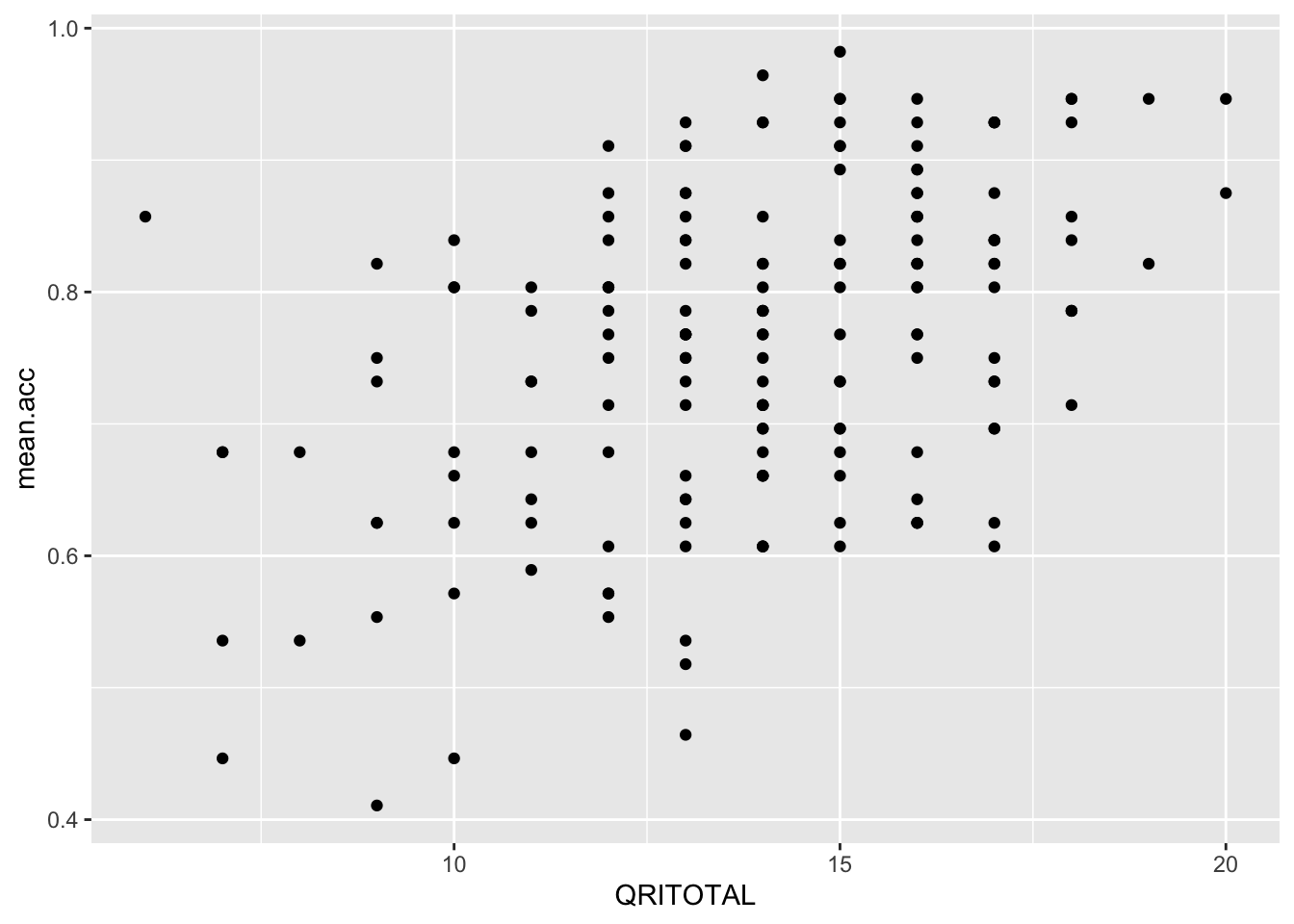
Q.17. What is the shape (direction) of the association between
QRITOTALandmean.acc?A.17. Increase in
QRITOTALis associated with increase inmean.acc
Step 6: Edit the scatterplots to make them look good
Task 10 – Edit the appearance of one plot step-by-step
Hint: Task 10 – We are going to edit:
- the appearance of the points using alpha, size and colour;
- the colour of the background using theme_bw();
- the appearance of the labels using labs().
Just like with geom_histogram() there is ggplot reference information for the geom you can use here – take a look:
https://ggplot2.tidyverse.org/reference/geom_point.html
You can find some example code and come back here if you are unsure what to do
Questions: Task 10
- Q.18. Change the appearance of the points using alpha, size and colour:
ggplot(data = study.two.gen, aes(x = HLVA, y = mean.acc)) +
geom_point(alpha = 0.5, size = 2, colour = "red") 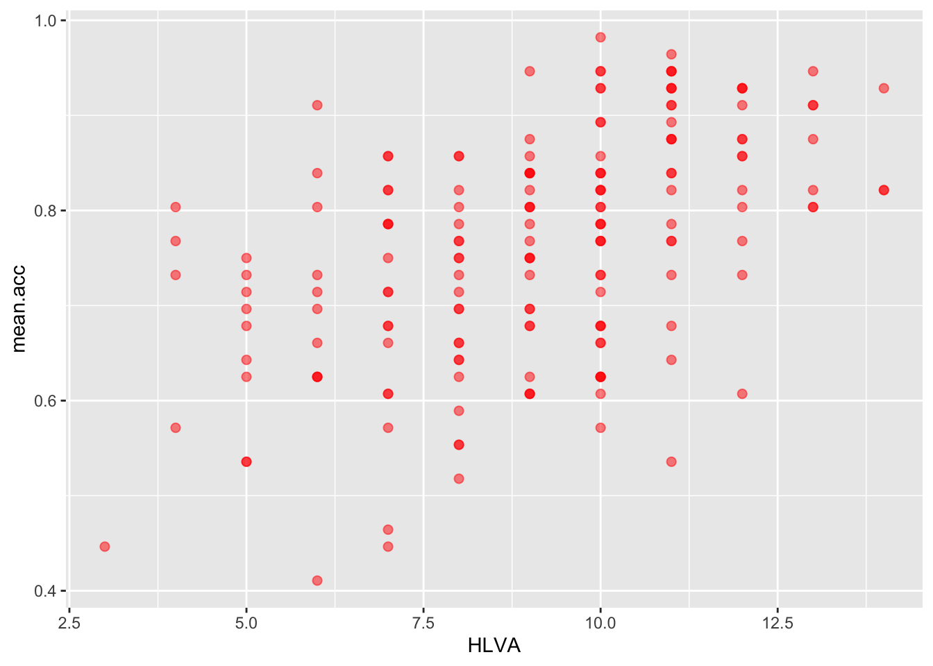
- Q.19. Edit the colour of the background using
theme_bw()
ggplot(data = study.two.gen, aes(x = HLVA, y = mean.acc)) +
  geom_point(alpha = 0.5, size = 2, colour = "red")   +
  theme_bw()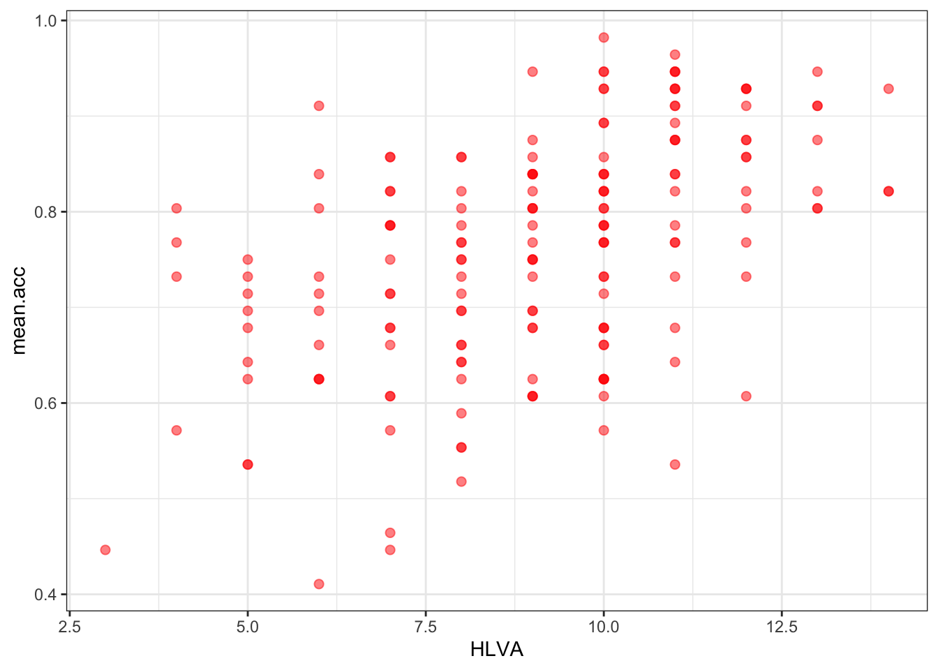
- Q.20. Edit the appearance of the labels using
labs()
ggplot(data = study.two.gen, aes(x = HLVA, y = mean.acc)) +
  geom_point(alpha = 0.5, size = 2, colour = "red")   +
  theme_bw() +
  labs(x = "HLVA", y = "mean accuracy")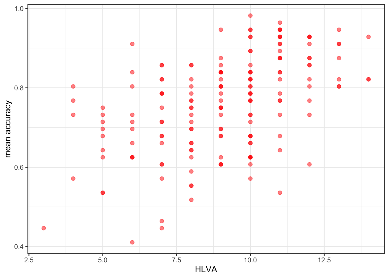
- Q.21. Can you find the ggplot reference page?
Do a search with the keywords “ggplot reference geom_point”
- A.21. – It is here:
Now you: experiment!
Step 7: Use correlation to to answer the research questions
Task 11 – Examine the correlation between mean accuracy (mean.acc) and some numeric predictor variables
We use cor.test()
- Q.22. What is r (given as
corin the output) for the correlation betweenHLVAandmean.acc?
cor.test(study.two.gen$HLVA, study.two.gen$mean.acc, method = "pearson", alternative = "two.sided")
    Pearson's product-moment correlation

data:  study.two.gen$HLVA and study.two.gen$mean.acc
t = 7.5288, df = 170, p-value = 2.866e-12
alternative hypothesis: true correlation is not equal to 0
95 percent confidence interval:
 0.3787626 0.6044611
sample estimates:
      cor
0.5000559
A.22. r = 0.5000559
Q.23. Is the correlation significant?
A.23. r is significant
Q.24. What are the values for t and p for the significance test for the correlation?
A.24. t = 7.5288, p = 2.866e-12
Q.25. What do you conclude, given the correlation results? (Maybe draw a scatterplot to examine the shape of the association.)
A.25. HLVA and mean.acc are positively correlated suggesting that as HLVA scores increase so also do mean.acc scores
Q.26. What is r (given as
corin the output) for the correlation betweenmean.selfandmean.acc?
cor.test(study.two.gen$mean.self, study.two.gen$mean.acc, method = "pearson", alternative = "two.sided")
    Pearson's product-moment correlation

data:  study.two.gen$mean.self and study.two.gen$mean.acc
t = 8.4991, df = 170, p-value = 9.356e-15
alternative hypothesis: true correlation is not equal to 0
95 percent confidence interval:
 0.4317217 0.6431596
sample estimates:
      cor
0.5460792
A.26. r = 0.5460792
Q.27. Is the correlation between
AGEandmean.accsignificant?
cor.test(study.two.gen$AGE, study.two.gen$mean.acc, method = "pearson", alternative = "two.sided")
    Pearson's product-moment correlation

data:  study.two.gen$AGE and study.two.gen$mean.acc
t = 0.30121, df = 170, p-value = 0.7636
alternative hypothesis: true correlation is not equal to 0
95 percent confidence interval:
 -0.1269774  0.1721354
sample estimates:
       cor
0.02309589
A.27. r is not significant
Q.28. What are the values for t and p for the significance test for the correlation between
QRITOTALandmean.acc?
cor.test(study.two.gen$QRITOTAL, study.two.gen$mean.acc, method = "pearson", alternative = "two.sided")
    Pearson's product-moment correlation

data:  study.two.gen$QRITOTAL and study.two.gen$mean.acc
t = 6.4711, df = 170, p-value = 9.993e-10
alternative hypothesis: true correlation is not equal to 0
95 percent confidence interval:
 0.3159538 0.5571417
sample estimates:
    cor
0.44457
A.28. t = 6.4711, p = 9.993e-10
Q.29. What do you conclude, given the correlation results, about the association between
SHIPLEYandmean.acc?
cor.test(study.two.gen$SHIPLEY, study.two.gen$mean.acc, method = "pearson", alternative = "two.sided")
    Pearson's product-moment correlation

data:  study.two.gen$SHIPLEY and study.two.gen$mean.acc
t = 6.8493, df = 170, p-value = 1.299e-10
alternative hypothesis: true correlation is not equal to 0
95 percent confidence interval:
 0.3390103 0.5746961
sample estimates:
      cor
0.4650537 - A.29.
SHIPLEYandmean.accare positively correlated suggesting that as HLVA scores increase so also do mean.acc scores