wk11

Published

January 13, 2025

Lab activity 2

Step 1: Load libraries

library(broom)
library(tidyverse)
── Attaching core tidyverse packages ──────────────────────── tidyverse 2.0.0 ──
✔ dplyr     1.2.0     ✔ readr     2.1.6
✔ forcats   1.0.1     ✔ stringr   1.6.0
✔ ggplot2   4.0.2     ✔ tibble    3.3.1
✔ lubridate 1.9.4     ✔ tidyr     1.3.2
✔ purrr     1.2.1     
── Conflicts ────────────────────────────────────────── tidyverse_conflicts() ──
✖ dplyr::filter() masks stats::filter()
✖ dplyr::lag()    masks stats::lag()
ℹ Use the conflicted package (<http://conflicted.r-lib.org/>) to force all conflicts to become errors

Step 2: Read in the data

mh <- read_csv("MillerHadenData.csv")
Rows: 25 Columns: 5
── Column specification ────────────────────────────────────────────────────────
Delimiter: ","
dbl (5): Participant, Abil, IQ, Home, TV

ℹ Use `spec()` to retrieve the full column specification for this data.
ℹ Specify the column types or set `show_col_types = FALSE` to quiet this message.
mh #just to have a quick look at the data
# A tibble: 25 × 5
   Participant  Abil    IQ  Home    TV
         <dbl> <dbl> <dbl> <dbl> <dbl>
 1           1    61   107   144   487
 2           2    56   109   123   608
 3           3    45    81   108   640
 4           4    66   100   155   493
 5           5    49    92   103   636
 6           6    62   105   161   407
 7           7    61    92   138   463
 8           8    55   101   119   717
 9           9    62   118   155   643
10          10    61    99   121   674
# ℹ 15 more rows

Step 3: Make a scatterplot

ggplot (mh, aes (x = TV, y = Home)) +
  geom_point() +
  geom_smooth(method = "lm", se = FALSE) +
  theme_bw() +
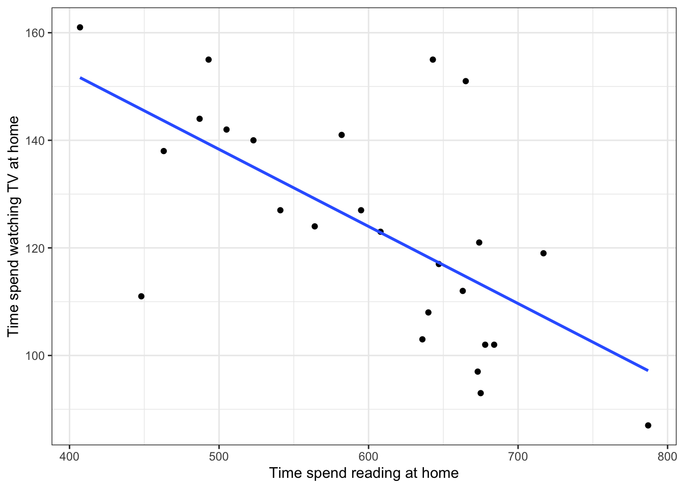
  labs(x = "Time spend reading at home", y = "Time spend watching TV at home")
`geom_smooth()` using formula = 'y ~ x'

Step 4: Conduct a correlation analysis

results <- cor.test(mh$Home, 
                    mh$TV, 
                    method = "pearson", 
                    alternative = "two.sided") %>% 
  tidy()
results
# A tibble: 1 × 8
  estimate statistic  p.value parameter conf.low conf.high method    alternative
     <dbl>     <dbl>    <dbl>     <int>    <dbl>     <dbl> <chr>     <chr>      
1   -0.648     -4.08 0.000465        23   -0.830    -0.339 Pearson'… two.sided  
r <- results %>%
  pull(estimate) %>%
  round(2)

p <- results %>%
  pull(p.value) %>%
  round(3)

df <- results %>%
  pull(parameter)

Step 5: Calculate the coefficient of determination (also called R-squared)

rsquared <- r*r
rsquaredPercent <- round(rsquared * 100, 0)

Step 6: Write up the results.

A Pearson’s correlation coefficient was used to assess the relationship between time spent watching TV and time spent reading at home. There was a significant negative correlation, r(23) = -.65, p < .001. As time spent watching TV increased, time spent reading at home decreased.

Lab activity 3: Hazardours alcohol use and impulsivity.

Step 1: Read in the data

data <- read_csv("alcoholUse_Impulsivity.csv")
Rows: 20 Columns: 3
── Column specification ────────────────────────────────────────────────────────
Delimiter: ","
dbl (3): participant, hau, imp

ℹ Use `spec()` to retrieve the full column specification for this data.
ℹ Specify the column types or set `show_col_types = FALSE` to quiet this message.
data
# A tibble: 20 × 3
   participant   hau   imp
         <dbl> <dbl> <dbl>
 1           1     8    76
 2           2     8    64
 3           3    13    81
 4           4     0    59
 5           5     7    61
 6           6    11    71
 7           7     0    38
 8           8     7    67
 9           9    11    66
10          10    12    59
11          11     1    70
12          12     9    74
13          13     5    42
14          14     2    53
15          15    11    62
16          16     8    64
17          17     9    96
18          18     7    65
19          19     5    55
20          20     4    58

Step 2: Plot the relationship between hazard alcohol use and impulsivity using a scatterplot and a line of best fit

ggplot(data, aes(x = hau, y = imp)) + 
  geom_point() +
  geom_smooth(method = "lm", se = FALSE) +
  theme_bw() +
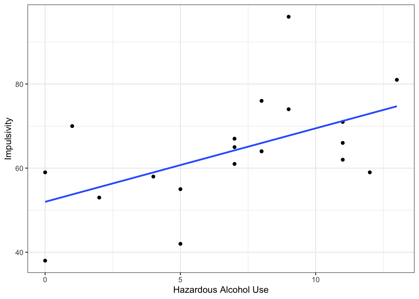
  labs(x = "Hazardous Alcohol Use", y = "Impulsivity")
`geom_smooth()` using formula = 'y ~ x'

Step 3: Conduct a correlation analysis, using Pearson’s r

results <- cor.test(data$hau, 
                    data$imp, 
                    method = "pearson", 
                    alternative = "two.sided") %>% 
  tidy()

results
# A tibble: 1 × 8
  estimate statistic p.value parameter conf.low conf.high method     alternative
     <dbl>     <dbl>   <dbl>     <int>    <dbl>     <dbl> <chr>      <chr>      
1    0.539      2.71  0.0143        18    0.126     0.792 Pearson's… two.sided  

Pull out Pearson’s r, the degrees of freedom and the p-value for reporting the results

r <- results %>%
  pull(estimate) %>%
  round(2)

df <- results %>%
  pull(parameter)

pvalue <- results %>%
  pull(p.value) %>%
  round(3)

rsquared <- r*r
rsquaredPercent <- round(rsquared * 100, 0)

Step 4: Write up the results

A Pearson’s correlation coefficient was used to assess the relationship alcohol use and impulsivity. There was a significant positive correlation, r(18) = .54, p < .014. As alcohol use increased, impulsivity also increased.
Back to top