```{r}
#| label: example
1 + 1
```
[1] 2Written by Rob Davies and Tom Beesley
I am sharing materials here to support the development of skills in producing reproducible reports using Quarto.
These materials should provide a quick entry to the what, why and how.
You can write in Quarto, in R-Studio (or any code editor), to produce:
Here, we are going to focus on reports that will be output as .docx.
What we are engaged in, here, is writing a combination of text and (here, R) code to generate a document.
This idea is old — see: e.g., Donald Knuth (who developed LaTex): https://www-cs-faculty.stanford.edu/~knuth/lp.html
But Quarto is a modern, efficient, way to do a powerful thing easily and efficiently.
https://posit.co/download/rstudio-desktop/
You need to do the installation in that order because R-Studio is the interface (an Interactive Development Editor (IDE)) but R does the work.
There are at least the following justifications for investing time in this (in no particular order):
Reproducible manuscripts: create documents that incorporate text, computation or plotting code, and bibliographic information in one place. By doing so you avoid the risk of losing track of what data underlie which calculations or plots or table summaries. Copy and pasting statistical results will inevitably lead to errors.
Automate the boring stuff: figure, table or section cross-referencing; producing documents in different formats; generating bibliographies.
Make manuscripts or presentations or notes share-able: Quarto is free so removes barrier to entry presented by licensed software like MS Word.
Make nice things: plots and tables will look better.
Open R-Studio.
Click on the menu buttons:
File \(\rightarrow\) New File \(\rightarrow\) Quarto Document...Word radio button, and the Create button.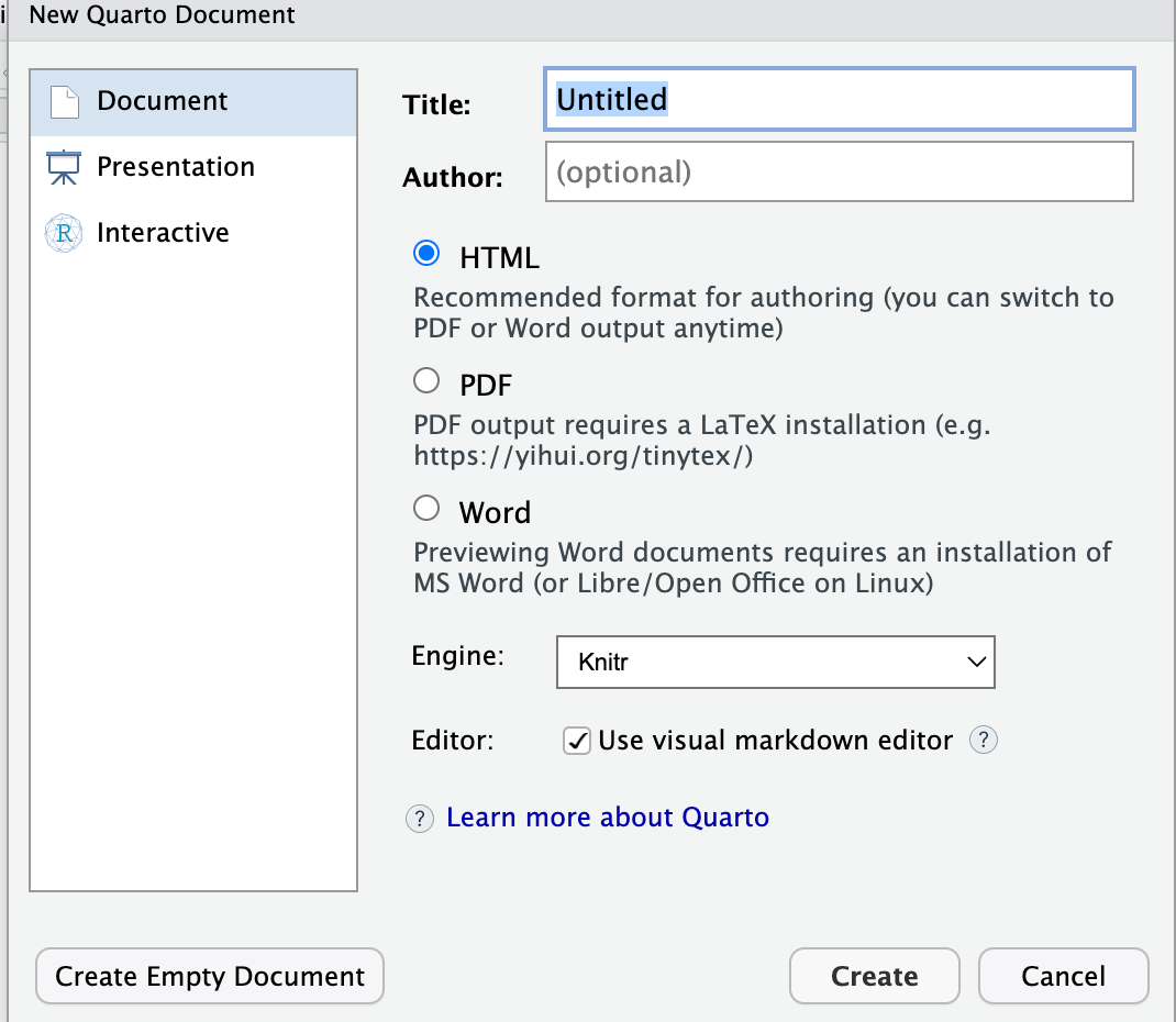
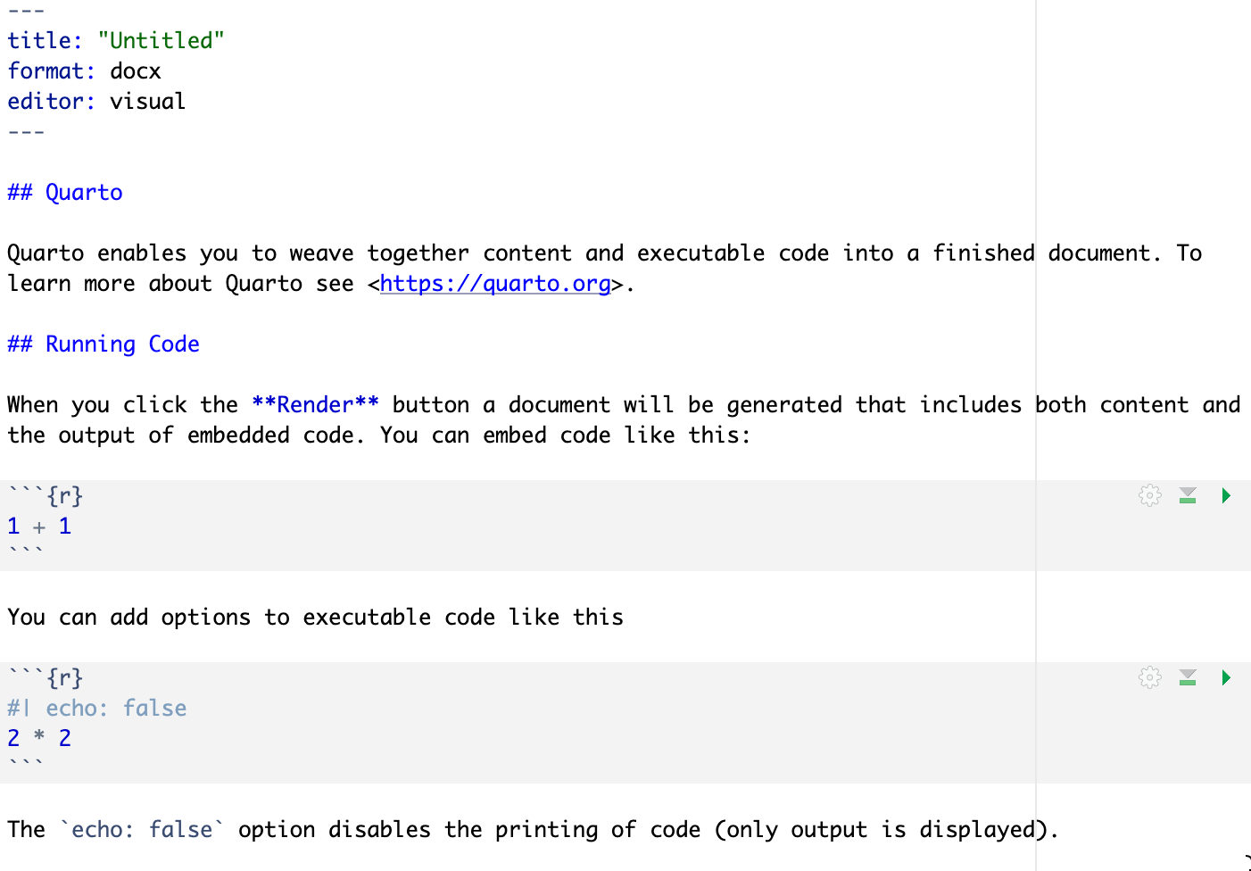
If you do that, you will see this file open:
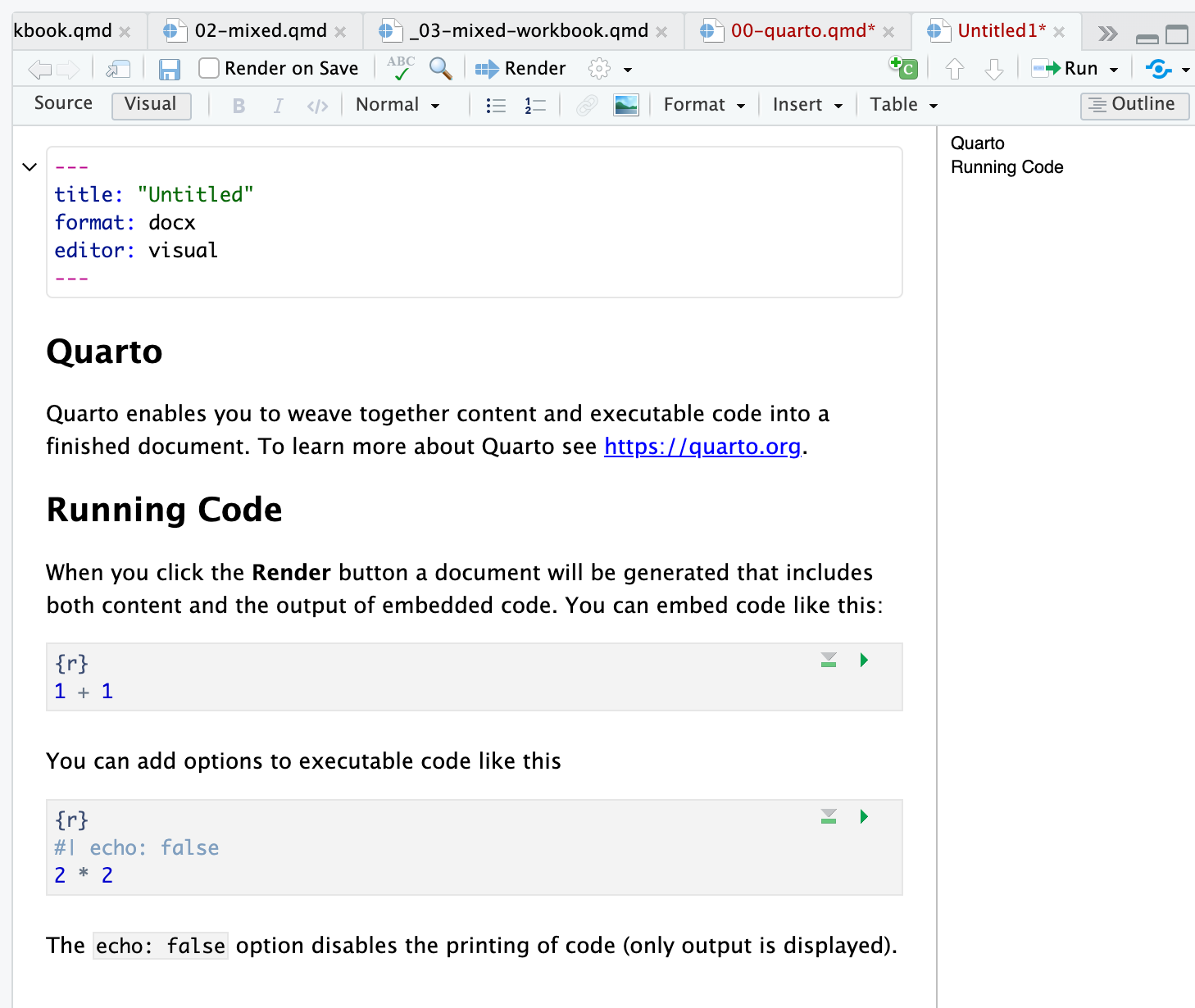
.qmd fileRender button at the top of the window? Click on it.This action will create a Quarto script file, a .qmd and will generate a Word .docx.
The whole script looks like this:
.qmd file: dummy fileAnd the .docx looks like this:
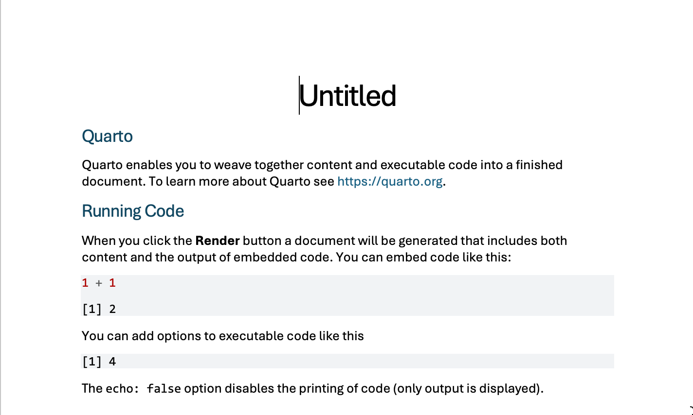
.qmd file: dummy file outputThis example shows you the main parts of a Quarto file. Let’s identify these parts before we move on:
yaml at the top is where you set document options:---
title: "Untitled"
format: docx
editor: visual
---Usually, this will be where you specify what output formats you want, whether you want a ToC, and (for APA 7 documents) it will be where you add author, title and abstract information, see more information here:
https://quarto.org/docs/output-formats/ms-word.html
## QuartoNotice the ## – the more hash signs you add, the lower the section title in the section hierarchy.
Quarto enables you to weave together content and executable code into a finished document. To learn more about Quarto see <https://quarto.org>.```{r}
#| label: example
1 + 1
```[1] 2The tick marks are at the top and bottom of the chunks tell R to read the code and work with it.
Notice that you can specify the identity (for cross-referencing) and the behaviour or appearance of the code at the top of the chunk.
In writing reports, we are often going to want to do tasks like:
We look at how to do these things next.
We will be working with an example data-set: click on the link to download the example data file.
study-one-general-participants.csvThe file has the structure you can see in the extract below.
| participant_ID | mean.acc | mean.self | study | AGE | SHIPLEY | HLVA | FACTOR3 | QRITOTAL | GENDER | EDUCATION | ETHNICITY |
|---|---|---|---|---|---|---|---|---|---|---|---|
| studytwo.1 | 0.4107143 | 6.071429 | studytwo | 26 | 27 | 6 | 50 | 9 | Female | Higher | Asian |
| studytwo.10 | 0.6071429 | 8.500000 | studytwo | 38 | 24 | 9 | 58 | 15 | Female | Secondary | White |
| studytwo.100 | 0.8750000 | 8.928571 | studytwo | 66 | 40 | 13 | 60 | 20 | Female | Higher | White |
| studytwo.101 | 0.9642857 | 8.500000 | studytwo | 21 | 31 | 11 | 59 | 14 | Female | Higher | White |
You can use the scroll bar at the bottom of the data window to view different columns.
You can see the columns:
participant_ID participant code;mean.acc average accuracy of response to questions testing understanding of health guidance (varies between 0-1);mean.self average self-rated accuracy of understanding of health guidance (varies between 1-9);study variable coding for what study the data were collected inAGE age in years;HLVA health literacy test score (varies between 1-16);SHIPLEY vocabulary knowledge test score (varies between 0-40);FACTOR3 reading strategy survey score (varies between 0-80);GENDER gender code;EDUCATION education level code;ETHNICITY ethnicity (Office National Statistics categories) code.Download and read the data into the R environment.
```{r}
#| label: data-read-in
study.two.gen <- read_csv("study-one-general-participants.csv")
```
Rows: 169 Columns: 12
── Column specification ────────────────────────────────────────────────────────
Delimiter: ","
chr (5): participant_ID, study, GENDER, EDUCATION, ETHNICITY
dbl (7): mean.acc, mean.self, AGE, SHIPLEY, HLVA, FACTOR3, QRITOTAL
ℹ Use `spec()` to retrieve the full column specification for this data.
ℹ Specify the column types or set `show_col_types = FALSE` to quiet this message.Let’s take a look at the distribution of ages in this sample.
You can do that by examining a histogram, see Figure 1.
You can embed the code that does that work, together with your text, in a chunk like this:
```{r}
#| label: fig-example-histogram
study.two.gen %>%
  ggplot(aes(x = AGE)) +
  geom_histogram() +
  labs(title = "Sample characteristics", x = "Age (years") +
  theme_bw()
```
`stat_bin()` using `bins = 30`. Pick better value `binwidth`.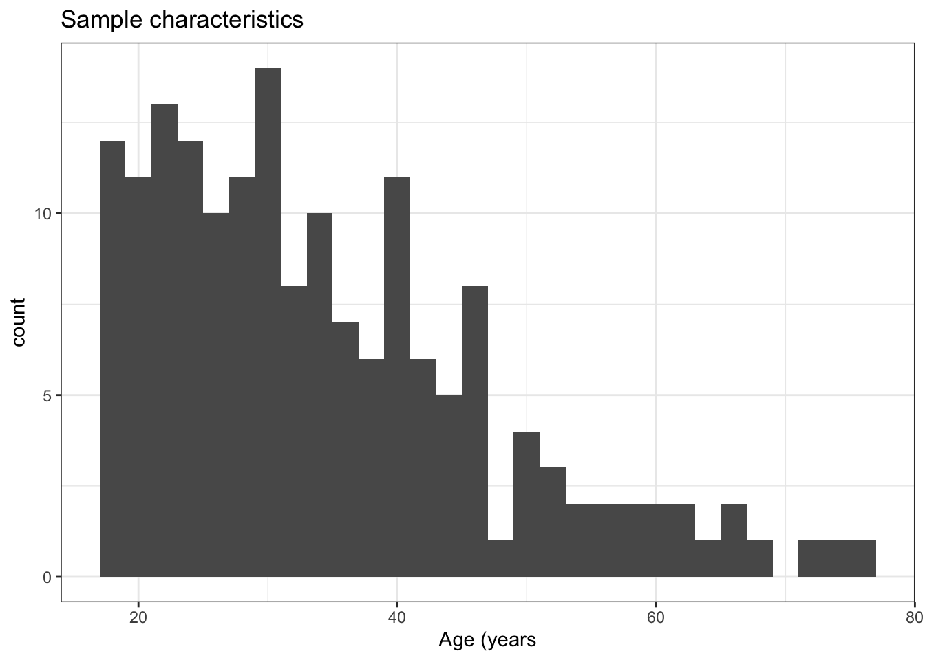
In practice, unless you are teaching, or sharing your workings as part of your documentation, you are going to want to embed a chunk of code to produce a plot so that the plot is presented in your output document while the code chunk that does the work is invisible (at output).
You may also want to add a figure caption and alt-text, and you will want to manipulate figure dimensions.
We can learn how to do that stuff while producing a scatterplot, next.
Let’s do something a little fancy, as in Figure 2: a scatterplot with marginal histograms.
To produce the plot, you will need to have installed the {ggExtra} library.
Let’s go through the control elements first.
Take a look at the chunk of code:
```{r}
#| label: fig-ggextra-demo-non-eval
#| fig-cap: "Scatterplot showing the potential association between accuracy of comprehension and health literacy"
#| fig-alt: "The figure presents a grid of scatterplots indicating the association between variables mean accuracy (on y-axis) and health literacy (x-axis) scores. The points are shown in black, and clustered such that higher health literacy scores tend to be associated with higher accuracy scores. The trend is indicated by a thick red line. Marginal histograms indicates the distributio of data on each variable."
#| warning: false
#| eval: false
#| fig-width: 4.5
#| fig-height: 4.5
# -- note that can use gridExtra
# -- to show marginal distributions in scatterplots
# https://github.com/daattali/ggExtra
plot <- study.two.gen %>%
  ggplot(aes(x = HLVA, y = mean.acc)) +
  geom_point(size = 1.75, alpha = .5) +
  geom_smooth(size = 1.5, colour = "red", method = "lm", se = FALSE) +
  xlim(0, 15) +
  ylim(0, 1.1)+
  theme_bw() +
  theme(
    axis.text = element_text(size = rel(1.15)),
    axis.title = element_text(size = rel(1.5))
  ) +
  labs(x = 'Health literacy (HLVA)', y = 'Mean accuracy')
ggExtra::ggMarginal(plot, type = "histogram", colour = "lightgrey", fill = "lightgrey")
```
Notice the bits of text at the top of the chunk:
#| label: fig-ggextra-demo-non-eval labels the chunk. You need this for figure referencing.#| fig-cap: "Scatterplot showing ..." adds the caption that will be shown next to the plot.#| fig-alt: "The figure presents ..." adds alt-text describing the plot for people who use screen readers.#| warning: false stops R from producing the plot with warnings.#| echo: false stops R from showing both the code and the plot.#| eval: false here stops R from actually running the code.#| fig-width: 4.5 adjusts figure width.#| fig-height: 4.5 adjusts figure height.You can see that I have added comments: # -- note that can use gridExtra to make the chunk self-documenting.
Now show the plot: Figure 2.
# -- note that can use gridExtra
# -- to show marginal distributions in scatterplots
# https://github.com/daattali/ggExtra
plot <- study.two.gen %>%
  ggplot(aes(x = HLVA, y = mean.acc)) +
  geom_point(size = 1.75, alpha = .5) +
  geom_smooth(size = 1.5, colour = "red", method = "lm", se = FALSE) +
  xlim(0, 15) +
  ylim(0, 1.1)+
  theme_bw() +
  theme(
    axis.text = element_text(size = rel(1.15)),
    axis.title = element_text(size = rel(1.5))
  ) +
  labs(x = 'Health literacy (HLVA)', y = 'Mean accuracy')
ggExtra::ggMarginal(plot, type = "histogram", colour = "lightgrey", fill = "lightgrey")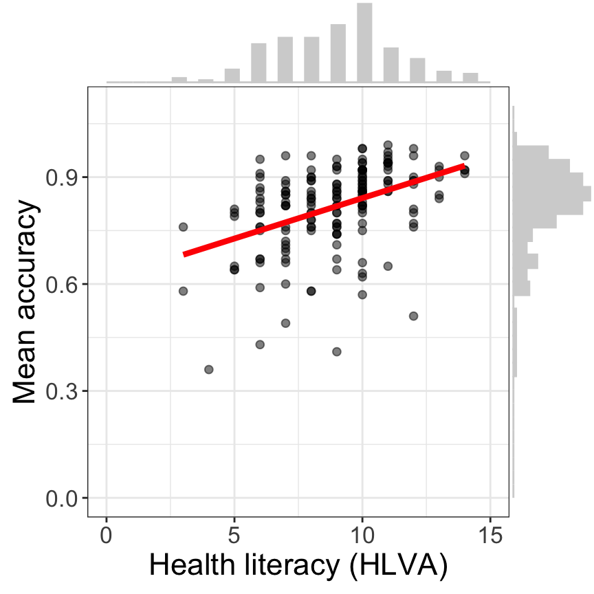
You can read more about chunk options here:
https://quarto.org/docs/computations/r.html#chunk-options
Note that the figure reference is computed by Quarto:
#| label: fig-ggextra-demo-eval (notice the grammar fig-...)@fig-ggextra-demo-eval then R will link the two objects, and write the reference in the rendered document.Read more about alt-text here:
https://mine-cetinkaya-rundel.github.io/quarto-tip-a-day/posts/28-fig-alt/
It is a hard habit to break but you never have to calculate things and enter values by hand again e.g.
This is the bit of code that does the calculation in the sentence:
r length(study.two.gen$participant_ID)`.For some statistical tests (t, cor, anovas, etc) there is a handy package and function, apa::apa that will render the statistical result in the correct apa format:
For example, you can wrap the apa() function around this cor.test() command to get automatically formatted statistical reports.
Now let’s fit a model and get some results.
Let’s assume we want to model the effect of health literacy on mean accuracy of understanding of health information.
Let’s say that our model assumes:
\[ y_i \sim \beta_0 + \beta_1X_1 + \epsilon_i \]
where:
where:
\(\beta_1X_1\) the coefficient of the effect of variation in health literacy.
This is how you write math in Quarto (notice the dollar signs):
$y_i \sim \beta_0 + \beta_1X_1 + \epsilon_i$I’m not writing the math because this is a serious model but to show off the equation writing capacities of Quarto.
https://quarto.org/docs/visual-editor/technical.html
It is much, much more user friendly, and accurate, than MS Word equation builders.
You can read more about writing equations in:
So fit the model and get a summary:
model <- lm(mean.acc ~ HLVA, data = study.two.gen)
summary(model)
Call:
lm(formula = mean.acc ~ HLVA, data = study.two.gen)

Residuals:
     Min       1Q   Median       3Q      Max
-0.40848 -0.05304  0.01880  0.07608  0.19968

Coefficients:
            Estimate Std. Error t value Pr(>|t|)
(Intercept)  0.61399    0.03387  18.128  < 2e-16 ***
HLVA         0.02272    0.00369   6.158 5.31e-09 ***
---
Signif. codes:  0 '***' 0.001 '**' 0.01 '*' 0.05 '.' 0.1 ' ' 1

Residual standard error: 0.1068 on 167 degrees of freedom
Multiple R-squared:  0.1851,    Adjusted R-squared:  0.1802
F-statistic: 37.92 on 1 and 167 DF,  p-value: 5.307e-09
Obviously, the summary is not formatted for presentation. We deal with that next.
We absolutely do not want to copy statistics from our model outputs because:
We want to get R to do the work for us.
There are a variety of ways to produce tables.
Table 1 illustrates one method.
# -- tidy model information
model.tidy <- tidy(model) %>%
  filter(term != "(Intercept)") %>%
  mutate(term = as.factor(term)) %>%
  mutate(term = fct_recode(term,

    "Health literacy (HLVA)" = "HLVA",

  )) %>%
  rename(
    "Predictor" = "term",
    "Estimate" = "estimate",
    "Standard error" = "std.error",
    "t" = "statistic"
  )

# -- present table of model information
kable(model.tidy, digits = 4) %>%
kable_styling(bootstrap_options = "striped")| Predictor | Estimate | Standard error | t | p.value |
|---|---|---|---|---|
| Health literacy (HLVA) | 0.0227 | 0.0037 | 6.1581 | 0 |
I can probably fix the p-value presentation but I’ll leave that there for now. The general principle is what counts:
But see also:
There is, however, a persuasive argument that model information (estimates, etc.) is best communicated visually, see the discussion in (e.g., Kastellec & Leoni, 2007)
I prefer to general marginal or conditional effects plots, see:
As you generate a full manuscript you’ll begin to wish there was an easy way to make it compatible with APA format, enabling easy submission to a journal. Thankfully there is a wonderful “extension” for doing just that: https://wjschne.github.io/apaquarto/. As the creator of this extension notes, “I wrote apaquarto so that I would never have to worry about APA style ever again.”. It is easy to intall and works well, plus the creator is extremely responsive to requests and bug reports on github.
Detailed instructions for installing and using the extension are given on the main github page:
https://github.com/wjschne/apaquarto
You can either convert an old article or you can create a new one using the extension.
See here for a list of the options you can control in this extension: https://wjschne.github.io/apaquarto/options.html
Adding references to a quarto document is easy. In the visual editor you can click Insert -> Citation. You can also just type “@” which will bring up a list of references contained in any “.bib” file you have in the current folder. bib files are common methods for storing bibliographic information about publications. You can export references in bib format from common referencing management systems such as Endnote, Mendeley, Zotero etc.
Once you have an exported bib file in your working directory, the citations will appear when you type “@”. Each item in the bib file has a “key”, which is typically the first author name, followed by a year. If you want the reference to appear in parentheses in your generated document, put the key in square parentheses in your document. Separate multiple references in the usual way with a semicolon.
Even more useful is if you link RStudio to a reference manager. Zotero is a popular and open source reference manager and plays well with quarto manuscripts. If you have Zotero installed, then the latest version of RStudio will detect it and import the library. This saves you creating the bib file, as RStudio will automatically add any references you type into a new bib file.
References are then assembled in apa format in a final reference list at the end of the document.
More info on this process here: https://posit.co/blog/rstudio-1-4-preview-citations/
There a bunch of resources to get APA formatted manuscripts:
You can cross-reference:
In output documents, the cross references appear as numbered hyperlinks, which is nice
From the writer’s perspective, the main benefit is that you no longer have to try to keep track of object numbering. If you make an edit, the tallying will change automatically, e.g., remove or move a figure, and all the figure reference numbers will be re-calculated automatically.
It’s easy to do citations and build bibliographies:
https://quarto.org/docs/visual-editor/technical.html#citations
And you can have the references styled using any style with a .csl (Citation Style Language):
https://www.zotero.org/styles?q=psychological%20bulletin
For people contributing to this tutorial, this:
https://bookdown.org/yihui/rmarkdown-cookbook/verbatim-code-chunks.html
is handy.
You can generate webpages, books, .pdf or .docx outputs from Quarto source files.